
Lettering Tattoos: A Guide for Men
Lettering tattoos are more than just ink; they’re a way to wear your personality and share meaningful messages through beautiful typography. If you're a man looking for body art that makes a statement, the right font and placement can make all the difference.
Exploring Lettering Styles
The style of lettering you choose sets the tone. Let's break down some popular options:
-
Script Fonts
These are all about flow and elegance, often resembling beautiful handwriting. They work especially well for names or cherished quotes.
-
Calligraphy
Think of the artistry of a skilled hand lettering – calligraphy brings that authentic feel to your tattoo. It's about those expressive brushstrokes.
-
Minimalist Fonts
Sometimes, less is more. Clean and modern minimalist fonts offer a subtle style – perfect for single words or short phrases.
-
Serif vs. Sans-serif
It's a small detail, but it matters: Serif fonts have those little decorative strokes at the ends of letters (like Times New Roman), while sans-serif fonts don’t (think Arial). This choice subtly changes the overall look and feel.
Finding the Perfect Placement
Where you put your lettering tattoo is just as important as the design itself. Here are a few popular spots:
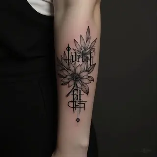
- Forearm: A classic choice, highly visible and easy to show off.
- Bicep/Upper Arm: More space for longer quotes or more intricate designs.
- Rib Cage: The curve of your ribs can beautifully complement flowing script fonts.
- Collarbone/Sternum: A slightly more subtle placement with an artistic touch.
Adding Depth and Meaning
Don't be afraid to add a little something extra! A few small illustrations around your lettering can really elevate the design.
And consider this: even the font itself can carry symbolic weight. If you’re after something specific, do a bit of research into its history – it's a nice detail to know.
Taking Care of Your New Ink
This is crucial. Follow your tattoo artist’s aftercare instructions *exactly*. Proper care ensures the best healing and keeps your lettering looking crisp for years to come.