Choosing a Readable Script Tattoo Font
A beautiful script tattoo can be a stunning piece of body art, but readability is key. Choosing a font that's both stylish and easy to read requires careful consideration.
Understanding Script Font Categories
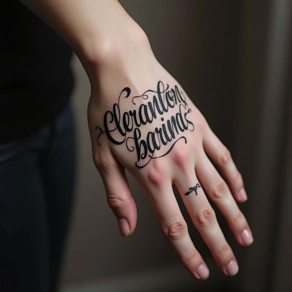
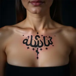
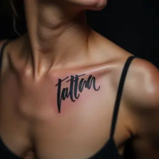
From elegant calligraphy to flowing cursive, script fonts come in many varieties. Some are inherently more readable than others. Highly stylized or overly ornate scripts can quickly become illegible over time as the ink spreads and the skin ages.
Factors Affecting Readability
- Size: Smaller fonts lose readability faster. Larger sizes generally work best, but placement considerations are crucial.
- Placement: Areas of the body that stretch or move significantly (like ribs or stomach) can distort the font, making it harder to read.
- Spacing: Tight spacing can blur letters together; too much space makes them look disjointed. Kerning (the spacing between individual letters) is critical.
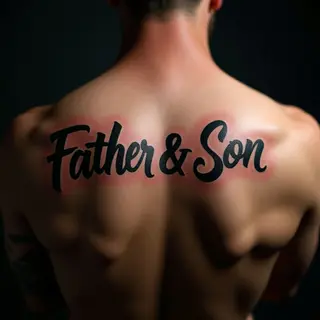
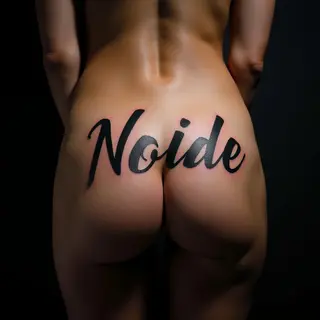
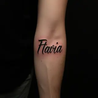
- Thickness/Weight: Bold script fonts tend to hold up better over time than thin ones.
Font Recommendations for Readability
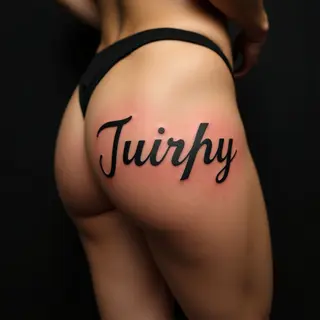
- Classic Cursive: Offers a timeless elegance and generally good readability.
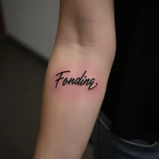
- Brush Script: Mimics handwriting, providing a personal touch while maintaining clarity.
- Blocky Scripts: Provide definition and contrast, improving legibility.
Consult with Your Artist
A skilled tattoo artist specializing in lettering will be able to advise you on the best font choices for your desired style and placement, ensuring your tattoo remains beautiful and readable for years to come. They can also adjust spacing and kerning to optimize readability.
